17 May Designing With Purpose
I’ve always dabbled in graphic design, creating print art, t-shirt designs, cartoons, and web images, but definitely at an amateur level. I’ve never had any formal training, and I don’t know much about the principles and practices of design. As any professional can tell you, being able to draw and knowing how to use Photoshop does not a designer make. That would be like saying, “I can hammer a nail really well, so I’m a master carpenter.”
Lately, I’ve decided to study more about graphic design in the hopes of upping my game and maybe even incorporating these skills into my IT career. Front-end design and web development have always been the most rewarding part of computer programming for me, and I think graphic design would play well into this.
One area that I’d like to get more experience and knowledge in specifically is logo design. I went through a re-branding effort a few years ago to create a new logo for my music career. I loved the whole process of designing the logo elements, defining the different logo sizes and formats, and even the tedious steps of applying my new logo to all the necessary artifacts (thumbnails, icons, posters, forms, business cards, web site, etc.).

![]()

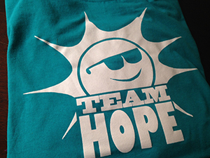
So when the daughter of a friend of mine asked if I could create a t-shirt design for her fundraising team, I decided to approach it like a logo design. Her team is raising money to cure to arthritis, something that affects her family very directly. Help out a good friend and use some creative skills doing it? I was in immediately.
She had decided that her team would be named “Team Hope” and that the logo might be a sun rising over the team name. Other than that, the only requirements were to keep it to a one-color design and integrate the words “Walk to Cure Arthritis” into the logo on the back of the shirt. I wanted to stick with the idea of the rising sun so that the logo would be hers. In this scenario, she was the boss, and I was the graphic designer trying to hit my marks.
The biggest challenge was creating a design that only used one color because the t-shirt color had not been decided yet. I knew that I’d have to use negative space in the design, but I didn’t know whether that space would be filled with a color lighter or darker than the elements around it. It had to work with both.
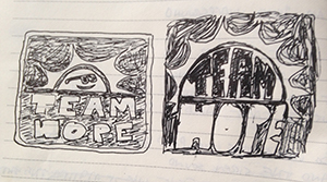
I started by scribbling some ideas in a notepad at a coffee shop one morning before work. Once I had an idea I liked, I tried sketching it out a little more formally with a pencil, and I scanned that into digital format. I don’t own a vector art software application (yet), so I just worked in Photoshop to clean up the design, pick out fonts and add the text.
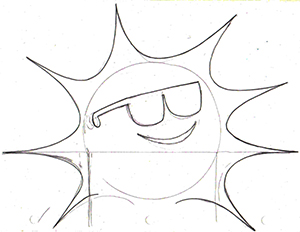
Finally I imported the bitmap image into an old version of Flash (yup, the animation software) and used the “trace bitmap” function to convert it to vector art. From there I can re-size the image and export it back out to whatever size
bitmap image needed. It’s a little like using bailing wire and duct tape, but hey, I’m no master carpenter!
Steve



Sorry, the comment form is closed at this time.