17 Aug Steve Weeks Music Web Site Redesign – What Was I Thinking?
Now that I had decided to embark on an overhaul of my web site, I had to ask myself, “Why in the world am I doing this?”
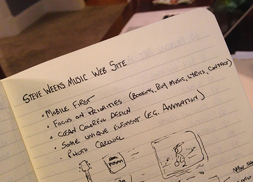
It may sound like an obvious question to ask, but before I started slinging code, I wanted to really take stock of what I hoped to accomplish by re-designing the site and approach it in a more measured process. So I brainstormed a bit about the purpose of launching a new site, and a few things became clear immediately. The problem with my current web site at the time, was that it just didn’t work well. It didn’t function well on mobile devices. It didn’t serve me well as a promotional tool. It didn’t guide visitors to the information they were looking for or to information I wanted them to have.
Having said that, there were a few things that it did do well. I had received quite a bit of positive feedback about the animated movie at the beginning and the interactive monkey that would drop into the screen occasionally. People especially liked the “Don’t Press” button which caused a dozen monkeys to appear suddenly. Basically, they liked the fun and unusual stuff.
So in a nutshell, I decided the site should function better while continuing to have some color and uniqueness. Based on this, I came up with the following requirements:
- Responsiveness: This is a term that means your web site responds well on mobile devices such as phones and tablets as well as on computer screens. Honestly, this was the most driving factor for re-vamping the site. My old site didn’t “respond” at all, so you had to drag the screen left and right and up and down to see everything. It’s called “keyhole browsing” and it’s really annoying.
- Mobile First Design: Many “responsive” sites are basically desktop computer layouts that just rearrange on smaller screens, and often the strategy for elements on a page is “just make them smaller”. However, most of the Internet traffic these days is on mobile devices, and I suspect the trend will continue in that direction. So I wanted to create a site that was designed for phones and tablets that “responded” outward to computer screen sizes. Looking great on a phone was the priority.
- Prioritization: Almost everything on my old site had equal footing. My performance schedule was given the same importance as a list of credentials, trivia questions and even outside links. This not only made the site cluttered, but it also meant that visitors weren’t been shown where to go. My new site needed to primarily showcase my music, booking process and contact information. Also, I wanted to make the pages that were popular a higher priority. Years of visitor statistics have taught me which pages people visit most. Lyrics, for example, had turned out to be an unexpectedly popular part of my site.
- Color and Uniqueness: Although I had taken lately to saying that my web site looked like a clown threw up, it was really the clutter that I wanted to lose, not the color. I still wanted a site that looked kid-friendly, not one that looked zen, minimal or corporate. I wanted a site that looked like a box of crayons. I also wanted the site to have some unusual aspects to it. I didn’t know what those would be, but I knew that if I was going to go through this development effort, I did not want to end up with just another web site.
- Lightweight Design: My site had way too much on it. Over the years I had tacked on various pages and sections based on things I thought were important at the time or random ideas I was exploring. I had a database of radio stations for crying out loud. I wanted to jettison all the unnecessary junk.
Now that I had my requirements, I was ready to start coding right? Nope. Next, I decided to inventory the new site which will be the subject of my next bog entry, so if you’re following along, check back in.


Sorry, the comment form is closed at this time.