

TeamUSA Responsive Framework




Category
Web DevelopmentAbout This Project
Overview
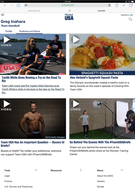
When I returned to software development after 5 years as a musician, I had to completely reeducate myself in new concepts like responsive design. I was lucky enough to quickly land a job with Aspenware a contracting firm which had a position with the US Olympic Paralympic Committee right downtown in Colorado Springs. I was also lucky that both Aspenware and the USOPC were willing to take a chance on me since they needed help making the teamysa.org responsive for the upcoming games in Brazil, I was very transparent with them that I was learning responsive design.
They were 6 months into a 9 month project to make the site responsive, and basically nothing had been accomplished. I’m not sure of all the details, but they were really behind the eight ball, and the start of the Olympic games was not going to move.
I immersed myself in Bootstrap which was the frame work they had chosen to make pages responsive, and it seemed straight forward enough, but the real issue was that they site used SiteCore as its CMS. This allowed the various National Governing Bodies (USA Hockey, USA Volleyball etc.) to maintain their own sub-sites within teamusa.org, and that meant that the page authors were completely self-educated and not necessarily adept at web design. In some cases, the person responsible for building web pages might be a temporary high school intern.
The object was to let the authors build pages by assembling layouts, sub-layouts, menus and custom components that were developed by the web development team and to ensure that whatever they built would work in desktop, tablet and mobile view ports. Although SiteCore did allow constraints to be placed on some layouts and components, the combinations of what contributors could build was almost infinite.
I inherited a page-by-page plan of attack that I quickly realized was not going to work, especially in the 3 month time frame remaining. They had been carving off single pages and tackling the layouts and components on that page, but those elements might be used on another page that was not responsive yet. And even if a page was made responsive, the author could change it tomorrow and break the design. This had resulted in responsive and non-responsive versions of everything. I realized the trick was how to make sure pages of unknown construction remained responsive.
I spend the first weekend design a new top-down plan of attack where layouts and sub layouts would be tackled and then the components after that. I actually made a demo using colored block to represent different components and demoed this to USOPC leadership, showing them how the layout remained rock solid no matter how the components were arranged.
I not only had to convince them of the approach, but I also had to instantiate a set of development rules that absolutely must be followed in order for this strategy to work. If the authors were going be allowed freedom, the developers were going to have to take on the responsibility of adhering to this new scaffolding.
Again, I was fortunate that they were open to the idea, and we moved forward. We implemented this framework for all existing and new elements and added properties in SiteCore that allowed the user to make choices in plain English that corresponded to Bootstrap concepts. A user could choose a layout, drop an Atheletes module into one of the placeholders and choose how many columns they wanted to display ono mobile phone (portrait and landscape), tablet, and desktop. Behind the scenes the C# MVC code would build the HTML using the Bootstrap framework to make a solid responsive design.
Challenges
- Extremely tight timeframe and an immovable deadline
- Numerous page authors of varying design ability
- Vast number of possible page layouts
- Lack of ability to educate the user community
Outcome
I’m proud to say, it worked. I was able to make the site responsive without stymying ongoing development of new features and bugfixes. The developers on the team adopted the new scaffolding for any new code and we collaborated on how to tackle the one-off situations. We had a completely responsive site before the start of the games and a clearly defined strategy for moving forward.
The USOPC was happy with my work and ended up keeping me on for 2 years. I became a full-stack developer, working on SiteCore, the .Net backend, and the front-end. When it came time for a massive Sitecore upgrade, I was asked to design a strategy and lead this effort.
Lessons Learned
I had to give credit to my co-workers and client for allowing me the latitude to design and approach to the problem. This is not always the case. But it is well-worth taking a moment to back up and design a strategy before jumping into implementation, even if the timeframe is tight.