17 Jan Steve Weeks Music Redesign – Color Me Coherent
Now that I had a wire frame for my new site, it was time to start adding a little style.
Understanding color is one of the more complicated and underestimated aspects of design. You can make an entire career out of understanding how various colors communicate different messages to an audience, which colors compliment each other and how many colors is too many.
One advantage of designing a site for family music is that the color scheme doesn’t have to be as subtle, and therefore as complicated, as on other sites. Bold, primary colors work just fine, and having red, blue, yellow, and green on the same page can actually work.
But that’s not to say that there should be no coherence. I had decided that I wanted my site to look like a box of crayons, but I wanted that to be the small box …the one with 8 colors not the one with 128 colors and the sharpener.
Since I had originally developed my site in a very organic but piecemeal manner, the color scheme was not very coherent. Each page (and sometimes each different element on a single page) was designed individually and represented whatever look and style I had decided to use at the time. The colors were all over the place.
I wanted my new site to have a common color palette, so for this design process I decided to create and implement a color scheme for the entire site before I applied it to any specific pages.
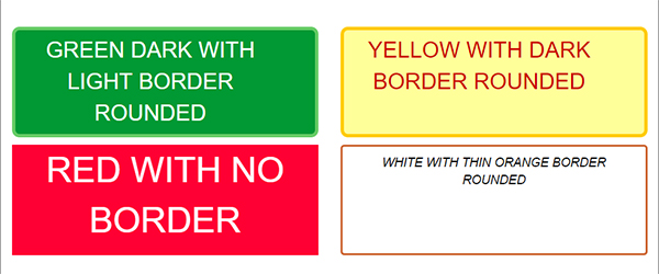
Using Photoshop, I played around with some primary colors, eventually choosing the exact ones that I wanted to use. For each color, I chose a dark and a light shade that complimented each other well. This way I could have all of the purple elements, for example, appear like they were related to each other regardless of whether they were light with a dark border, dark with a light border or with no border at all.
At this point, I actually got to start writing some code for the first time in the process …well CSS code at least.
I created the beginnings of a CSS file in which I added color definitions and classes for the various combinations. So for example, I had a class for dark blue, light blue, dark red, light red, etc. and additional classes to represent whether an element should have a border, rounded corners etc.

I created some simple test pages with mock elements on them so I could see the colors in action. For those interested, the HTML looked something like:
<div class=”red border-thick”>
</div>
<div class=”orange border-medium”>
</div>
I had created the first building blocks for my site.
But styling isn’t as simple as color alone. I still needed to think a little about texture and type before I was ready to code my first real page.
NEXT: The Fine Print


Sorry, the comment form is closed at this time.