

01 Feb Steve Weeks Music Redesign – The Fine Print
I’m certainly no graphic design expert, but through the limited study that I have done so far I’ve learned that design components are sometimes grouped in terms of three general areas: layout, color and type. So I decided to take on the re-design of my own web site using these concepts as my road map.
Layout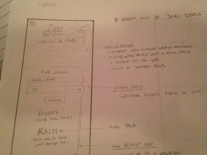
Layout refers to the shape, size, position, and, in the case of a responsive web site, behavior of design elements. I utilized wire-frames to define the layout of my design and how the elements should respond on different displays.
Color
As I mentioned in the previous post, I put a good deal of thought into developing a consistent color strategy, and I used CSS styles to implement my color scheme.
Type
Type encompasses the fonts, size and placement of text in a design. I’m also going to include some thoughts about texture here also. Most designers would consider texture to be more closely related to color, but I’m going to talk about it along with type because I used both to try and address a very specific juxtaposition.
On one hand, I wanted the message that my new site communicates to be a very professional one because I use my site as the primary point of reference when I’m trying to book a gig, sell an idea or chase down an opportunity. I’ve received direct feedback from people that professionalism is something that they appreciate and highly value, and I want my online presence to immediately give potential clients a sense of reliability, experience, and quality about Steve Weeks Music.
On the other hand, I’ve also been told by these same people that they find it really refreshing to be working directly with me as the artist instead of a booking agent or manager. I think the personal touch gives me a little advantage, so my new site needed to communicate this as well.
Professional but personal …that’s the trick.
I decided that the overall design should look fairly polished but that a few elements throughout the site should stand out and convey a warm, almost hand-made feeling. I would use type and texture to accomplish this.
In terms of type, I chose a couple some very professional-looking , tried-and-true fonts like Georgia, Times New Roman and Arial . I wanted to use sanserif fonts for headers and titles and serif fonts for general text. These would work well for sections like reviews, credentials, performance details and other professional items.
However, I also wanted to incorporate more whimsical and hand-written style fonts which I would use sparingly to give visitors the feeling that there was actually a real person behind the web site. In order to accomplish this, I decided to use web fonts which was also a concept I wanted to explore and learn more about. Basically this involves putting a link to the font file in your HTML, and it opens up a world of fonts not automatically available on a typical browser.
The downside is that loading a font over the Internet can impact a page’s performance. Luckily the Google Fonts site provides the ability to analyze a font’s impact on your site and even generates the script tag you’ll need. If you want to use some interesting fonts on a web page, I recommend checking it out.
I ended up choosing some fun but professional fonts like Amatic, Boogaloo and Monserrat. In case you’re interested, the HTML script tags look like this:
<link href=’https://fonts.googleapis.com/css?family=Amatic+SC:400,700′ rel=’stylesheet’ type=’text/css’>
<link href=’https://fonts.googleapis.com/css?family=Boogaloo’ rel=’stylesheet’ type=’text/css’>
<link href=’https://fonts.googleapis.com/css?family=Montserrat:400,700′ rel=’stylesheet’ type=’text/css’>
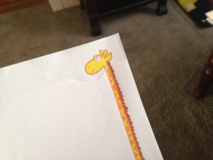
My Giraffe Theme
I decided to use texture in much the same manner. Again most of the graphics on the site would be very professionally styled through the use of vector art, high quality images and a consistent color scheme. But I wanted to throw in a rogue hand-drawn image which would have the texture of a colored pencil drawing, and which would weave in and out of the other elements on the page like it had grown freely amongst carefully-placed blocks. My idea for a randomly generated “theme” image seemed to be a good place for that.
Basically I wanted visitors to steveweeksmusic.com to see a very professional site but to occasionally catch glimpses of the artist peeking through …like I had hacked my own site!
I had a layout, color scheme, and type/texture strategy for my design. I needed put this together with the site inventory I had created and start implementing some pages.
Becky Steenburg
Posted at 09:58h, 02 FebruaryBrilliant!