
03 Jan Steve Weeks Music Redesign – A Skeleton
So far in my effort to redesign my web site, I had gathered requirements and created a content inventory. Now that I knew “what” was going to be on the new site, it was time to start thinking about how it was going to look.
I had to resist the urge to jump right into drawing images, choosing colors and coding pages. I had promised myself that I was going to take my time and stick to a plan on this redesign, so the next step was to start defining a layout.
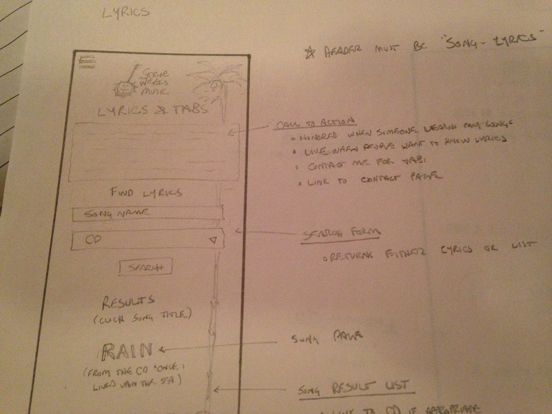
I decided to create wire-frames for the various pages on the site. For those of you who may not know, a wire-frame is a simple, black & white drawing of the elements on a page using only lines and shapes. It’s sort of like a skeleton for the page and intentionally avoids the use of specific colors, images or text.
Since mobile responsiveness was an extremely important requirement for my new site, I created blank templates for three different display sizes. One approximated the aspect of a mobile phone display, the second a tablet and the third a desktop computer. These days there are more and more devices that people can use to browse the web (watches, car consoles, glasses etc.), but phone, tablet and desktop were the three main devices that I decided to target.
Don’t let the terminology fool you, creating these templates was really as simple as drawing different sized rectangles on paper and making copies. You can even find ready-made booklets of these online.
Then it was back to the coffee shop! I tackled one page at a time, sketching a rough design for each of the 3 display sizes. I used a pencil and drew very lightly as I made a lot of changes along the way. I put my erasure to work as much as the lead.
Since I had decided to do a “mobile-first” design, I created a wire-frame for the phone display first and then decided from there how the page would respond on tablet and desktop.
Not only did this step help me visualize a layout for the web site, but it also allowed me to get an idea of priority and placement for certain elements on the pages and to define common elements across all pages (e.g. logo, menu, footer).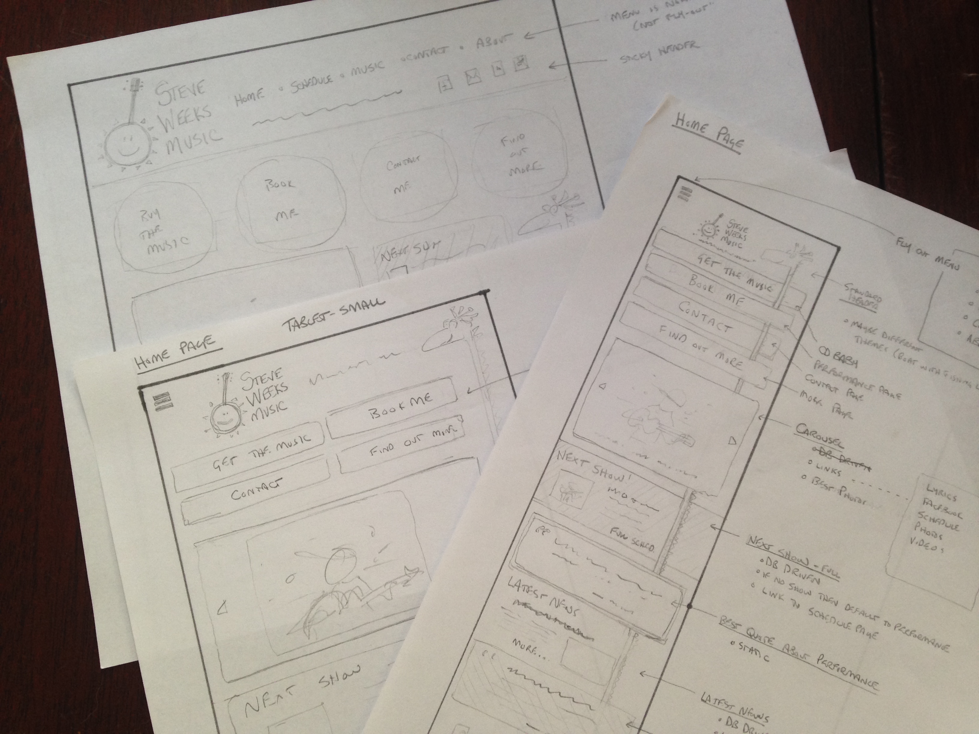
As the layout began to take shape, a few light bulbs went off that also helped me refine my requirements, develop new ideas and even glimpse a little ahead in the design styling. Even though I was trying to adhere to a methodology, it was not entirely linear. I was constantly refining backwards and defining forwards.
Some of the interesting ideas that came out of this portion of the design were:
- Theme Images: One of my requirements was to add unique elements to the site. Once I could visually see the aspect of a phone (tall and narrow), I decided I wanted some sort of image that ran down the length of the page, weaving in and out of the content. This lead me to the idea of a randomly generated theme image. The first theme idea I had was a giraffe!
- Reviews Slideshow: Drawing a rough sketch of a “review” element gave me the idea that reviews should cycle through in a slideshow fashion. I realized that this would be a good technical/design challenge since reviews can be of different lengths.
- DB Driven Reviews/Awards: Sketching out pages for songs and CDs made me realize that it would be great to have a hierarchy of review and awards. For example, if a song had a review, I’d display that. If not, I’d display a review for the CD the song was on. If that didn’t exist, I’d default to a general review about my music. This was an example of the design leading to a database requriement.
In retrospect, this part of the design process turned out to be way more fun than I thought it would, and it really helped me create a better site than I would have had I just started creating images, writing content and implementing code as I sometimes tend to do.
…but now it was time to get really creative! Time to paint some color in those lines!
Sorry, the comment form is closed at this time.