
13 Mar Steve Weeks Music Redesign – The Rubber Meets the Road
 If you’ve been following my last few blogs, you’ll know that I decided to re-vamp my web site using a mobile-first design strategy. I wanted to undertake this effort because my old site was outdated, cluttered, and non-responsive on mobile devices. I also wanted to use the redesign as an opportunity to learn new technologies and methodologies …and to support my goal of learning more about design principles.
I had gone through steps to define requirements, inventory content, design a layout, create a color and type scheme and choose the components of my technology framework. Now it was time to sling a little code!
I promised to keep this series of blogs focused on the design process and not stray too far into technical details, so I won’t talk here much about specific code I wrote. However, there are a few technical hurdles that came out of my design that I think are appropriate, and hopefully interesting, to cover.
This blog is about the first of those challenges, the theme image.
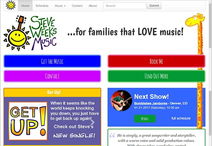
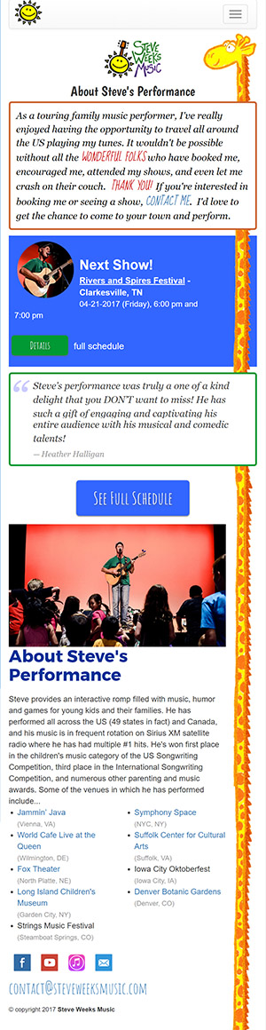
One of the most significant elements to come out of my mobile-first design was the idea of a randomly chosen image which would run the height of each page, weaving in and out of the other elements. I say significant because I would never have come up with this concept had I started my design with a desktop view in mind.
By starting my layout design process with a mobile phone view, I was faced with a problem. Staring at a blank wireframe that’s tall and skinny, it becomes immediately apparent that making the page fun and interesting will be a challenge. Real estate on such a device is precious, and if you’re simply adapting an existing desktop layout to this aspect, you’ll probably come to the same design solution everyone does: eliminate elements, shrink images and stack everything on top of each other in one big column.
However, starting with a blank slate on a mobile device view, you’re forced to think outside of the box, or more accurately inside of a tall, narrow one.
I decided that I wanted to include an element on the page that would hold a thread of interest all the way down as the page was scrolled, and like a thread, it would have to be very thin because there isn’t much width to work with. It would also have to be dynamic so that it worked on a variety of devices and aspect ratios.
That’s how I came up with the idea of images like a giraffe, a dinosaur, or a kite with a long tail.
This presented a technical challenge for a few reasons.
First, how would I make the image “weave” in and out of the page design? I accomplished this by using the z-index property of CSS classes. By assigning the theme image a known z-index, I could give all the other elements z-index values higher or lower than the image creating the visual effect that it was weaving in front and behind things on the page. Some elements would need to be in front of the image at certain aspects and behind at others. I created CSS classes with meaningful names (e.g. in-front-of-image, behind-image-xs) to handle this.
This led me to another problem. I needed to ensure that the theme image didn’t interfere with the ability to read and interact with content on the page. So for those elements that were behind the theme image, I created a class that moved the content of that element over and out of the way of the theme image.
For example, if I had a blue box on the page that was behind the theme image (let’s say a giraffe) which contained the information for my next performance, I wanted that information to “scoot over” so it could be read and the links still chosen. I had to control this based on my bootstrap sizes, so I ended up with classes like “avoid-image-xs” and “avoid-image-md”.
The third challenge of implementing my theme image was ensuring that it ran the entire height of the page whatever eight that was but that it didn’t make the page taller than the content creating white space at the bottom.
This took a little more noodling than I expected. I tried making the image a repeating background of a <div> element, but this didn’t work because a background image doesn’t affect the height of the element. I didn’t want to use JavaScript to calculate the height either, because I didn’t’ think that this approach was as elegant.
In the end, I went with a pretty raw solution. I drew an image that was way taller than any page was ever going to have, and then placed it in a div with an overflow-y property of “hidden”. This causes the image to get cut off at whatever height the current page is. It seems to work well. I’m not thrilled that I’m loading a larger image than I need, but it’s a pretty small image and doesn’t seem to affect the load time of the page. I’m still thinking about this one honestly.
So that’s how my mobile first design ended up presenting me with the technical challenge of a theme image. But there were a couple others.
NEXT: Steve Weeks Music Redesign – Text Slideshows and Collapsable content
Sorry, the comment form is closed at this time.